前端审美积累贴
610
 zshining2026-04-28
求分享一些纯粹的美丽前端,打算积累一下审美><
主楼- 皮卡皮卡吃屁2026-04-28
- maweirdos2026-04-28
提供prompt提示词一键复用

StyleKit
StyleKit - UI Design Prompts, Visual Styles & AI-Friendly Design System
120+ visual styles with design tokens, component recipes, Tailwind-ready patterns, and AI prompts for beautiful, consistent website UI.

Design Prompts
Design Prompts - AI-Powered Design Style Explorer
Explore 31+ stunning design styles rendered from the same data. Get AI-ready prompts to recreate any aesthetic in your own projects.

UI Style Prompt

UI Style Prompt - AI UI 设计风格提示词库
探索 70+ 种现代 UI 设计风格,获取专业 AI 生成提示词。
审美提升:

godly.website

Godly - Astronomically good web design inspiration
A hand-picked curation of over 1,000 of the best AI, Web3, portfolio, and other outstanding websites on the Internet.

Dribbble

Dribbble - Discover the World’s Top Designers & Creative Professionals
Find Top Designers & Creative Professionals on Dribbble. We are where designers gain inspiration, feedback, community, and jobs. Your best resource to discover and connect with designers worldwide.
素材:

landingfolio.com
The Best Landing Page Design Inspiration, Templates and More
Looking for landing page inspiration? We've got you covered. Landingfolio features the best landing page designs, templates, component and more on the web. Get inspired by real landing page examples.
Lucide
Lucide Icons
Beautiful & consistent icon toolkit made by the community.
欢迎各位佬继续补充
- zshining2026-04-29
nb,直接就是一个狠狠的审美积累 感谢佬
- zzerd2026-05-25
我的建议是先生图,图片抽卡比较快,直接写代码很浪费token。有ui图了就可以生成设计方案,色彩方案,这样最后做出来的效果比较好
- Atticus2026-05-25
学习下,前面做的项目,天天被老板吐槽UI丑 ^-^
- lufei2026-05-25
好像有一个专门前端的skills
- 南山2026-05-25
佬友收藏好丰富,收藏一波,后面总能用上
- ReactGo2026-05-25

Awwwards
Awwwards - Website Awards - Best Web Design Trends
Awwwards are the Website Awards that recognize and promote the talent and effort of the best developers, designers and web agencies in the world.
- Yohji12026-05-25
我最近也在vibecoding做网页,网页没什么实际功能,做展示用,前端的审美设计的确太关键了,那些大佬做的网页,简直是艺术品,我等codex干活的时候,没事经常上Awwwards上面看,实在夸张,不过这些应该属于是设计范畴了吧,感觉也不全是前端的活
Awwwards
Awwwards - Website Awards - Best Web Design Trends
Awwwards are the Website Awards that recognize and promote the talent and effort of the best developers, designers and web agencies in the world.
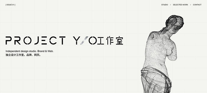
另外分享一些我自己简单总结的优秀设计分享,纯文科生,语言表达可能很粗糙,有些专业术语说不上来 ^-^,权当分享,双!!号标注的,是我觉得复刻起来应该不算太难,但效果很好的点
1.https://good-fella.com/
!网站的“How it works”部分,下滑展示多个图片时,左侧的序号部分,有一个橙色的极小色块的动画,值得参考,可以作为序号滚动时的点缀。!
!以及该网站的导航栏设计值得参考。!
还有整体的设计语言中,主题色橙色的色块多次参与到动画中的设计思想,能进一步深化网页整体的设计视觉。2.AVA SRG
!初次进入网站时的加载页动画设计!
贯穿网页全过程的主视觉设计:一个3D的手套模型,贯穿始终。
撞色设计:灰/深红/纸张质感的米色。3.https://nfinitepaper.com/
!网站的第4个页面的粒子点云设计,大面积铺满全屏的扩散-聚合的动画设计!4.https://follow.art/
!不同页面的配色完全不同,但色系搭配合理,同时多个页面的主题色会被应用到整个网页的背景色!
不同页面切换均采用一套动画设计,但通过不同的页面配色设计,很有效的解决了同质化设计所带来的无聊体验问题。5.https://www.maxmilkin.com/
优秀的网页留白设计,页面文字比较小,留白大,但十分和谐,不觉得空。6.https://digilab.co/
从第1页下滑开始设计了一个动画横跨第2页(可以把只有纯色背景但存在丝线汇集动画的内容看作第2页)来为第3页背景配色的大变动做铺垫过渡,解决了第1页和第3页配色相差过大带来的突兀。7.https://stefanvitasovic.dev/
Hero页设计。8.https://18.burocratik.com/
!区别于传统网页的纵向下滑叙事,此网站采用的是横向穿越,同时有一条贯穿整个交互过程的细线,随着滚轮下滑从左到右的移动,增强了引导性。!
鼠标在网站随意移动会带出一系列图片,而且此设计做到了传达设计的同时不影响信息传达,在关键的详细文本区做了隔离,鼠标不会带出图片。 - Solaris2026-08-07
感谢佬友,之前一直用 ai 做不出好看的 ui。现在可以狠狠学习了^-^